In the IELTS writing task 1, most of the time we have to explain the trends in line graphs. For this, you need vocabulary, as you are expected to summarize, compare, and explain the given information in detail, and obviously, you cannot repeat the same words again and again because it decreases your score in the vocabulary part of the IELTS writing assessment criteria.
Important Vocabulary for Line Graphs – IELTS Writing Task 1
While explaining the graphs, you need a set of vocabulary, and each set has a different purpose. The following are the different sets of words that we need to discuss the line graphs accurately for higher bands in IELTS writing:
- To describe the change (upward/downward)
- To show what kind of change it is (slight or drastic)
- Use of prepositions (By, To, At)
This article covers every single word from these sets that you need to explain the graphs in the IELTS writing task 1. Once you finish reading this article, you will feel confident and prepared to achieve your desired scores in the IELTS writing module.
1. To describe the change (upward, downward)
In case you have a line graph, you will need to explain the change occurring in each category that is given in the graph. Take an example of this graph, here we can see that some categories are increasing and some are decreasing, so the list of words that we can use to explain such a type of change is given below:
(i) Words for describing a decreasing trend in a Line Graph:
Read the words below with examples that will help you explain such a trend:
- Decline: After reaching a peak in 2016, the consumption of fruits shows a sharp decline.
- Go Down: The figures for fruit consumption go down from around 25 million tons in 2016 to nearly 14 million tons in 2022.
- To fall: Fruit consumption continued to fall steadily over this period (2016-2022).
- To reduce: There was a reduction in fruit intake from 2016 to 2022.
- To decrease: Fruit intake decreased from 25 million tons in 2016 to 14 million tons in 2022.
(ii) Words for describing an increasing trend in a Line Graph:
Read the words below with examples that will help you explain such a trend:

- Rise: The consumption of meat shows a steady rise from 2006 to 2022, reaching almost 30 million tons.
- Increase: Vegetable consumption experienced an increase after 2016, climbing towards 28 million tons by 2022.
- Go up: The figures for meat continuously go up, without showing any period of decline.
- Growth: There was noticeable growth in vegetable consumption after 2015, especially in the final years of the period.
2. Showing what kind of change we have
While describing the line graphs, it is important to mention the kind of change happening in each category. We cannot just say that the value of a certain category increased or decreased in a specific year; we should also mention if the increase was gradual, slight, drastic, etc. Learn the use of each such word below:
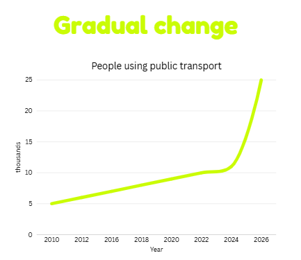
(i) Gradual change:
- Use: It shows a slow change.
- Example: The use of public transport increased gradually from 2010 to 2012.
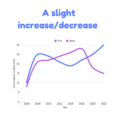
(ii) Slight increase or decrease:
- Use: It shows a small change.
- Example: There was a slight increase in the consumption of meat between 2010 and 2018.
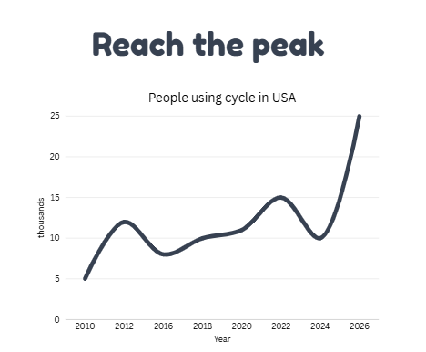
(iii) Reach the Peak:
- Use: It shows the highest point.
- Example: There was a slight increase in the consumption of meat between 2010 and 2018.
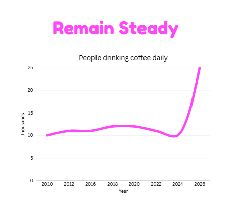
(iv) Remain Steady or Unchanged:
- Use: It shows almost no change in the figures.
- Example: The number of people drinking coffee daily remained steady from 2010 to 2024.
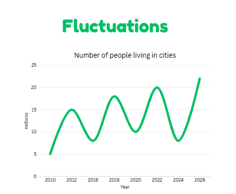
(v) Fluctuations:
- Use: It shows continuous up and down changes.
- Example: The number of people living in cities fluctuated during this period.
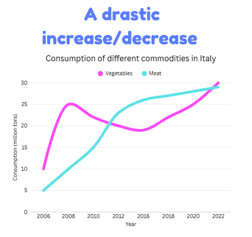
(vi) Drastic change:
- Use: It shows a sudden or major change.
- Example: The number of people living in cities fluctuated during this period.
3. Use of Prepositions
We can also use prepositions to specifically mention a point or figure on the line graph. The three most common prepositions that we use are:
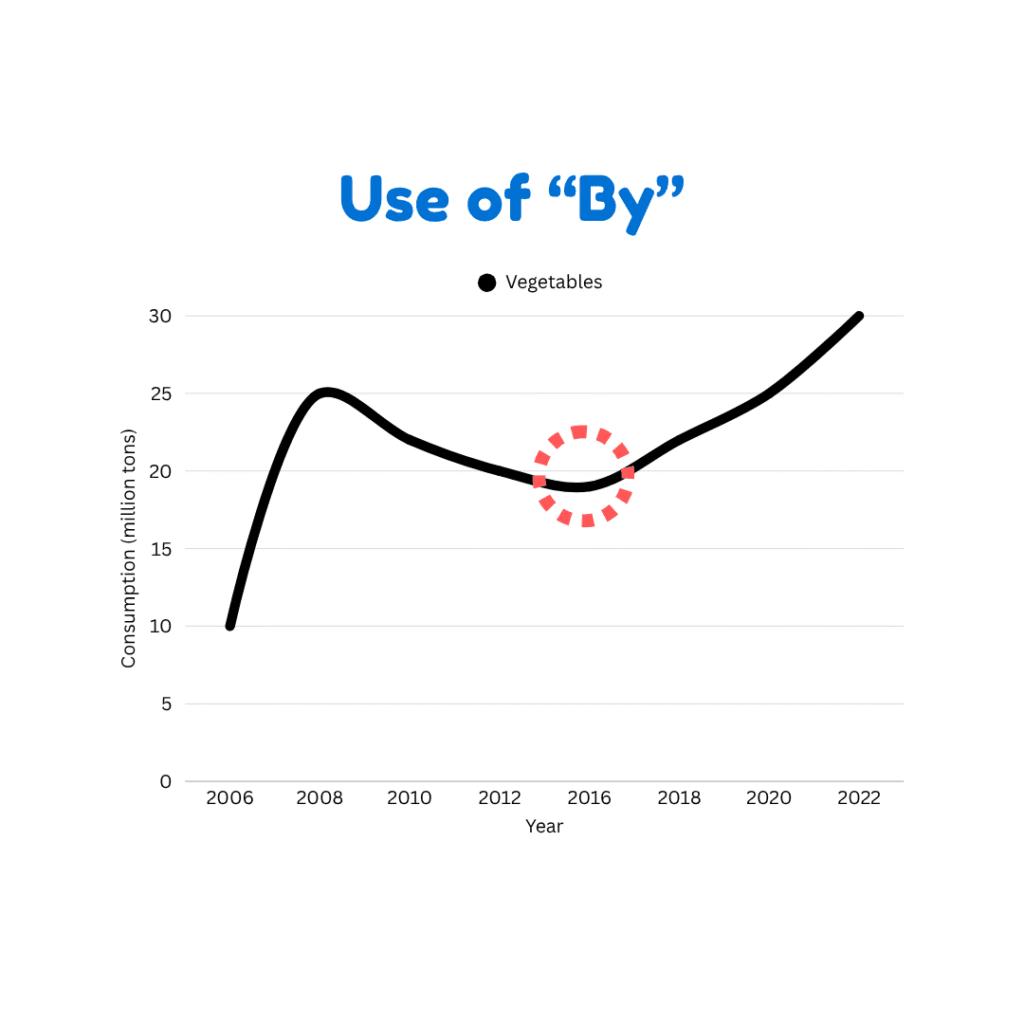
(i) Use of the Preposition “By” in Line Graphs:
- Use: It shows the amount of change
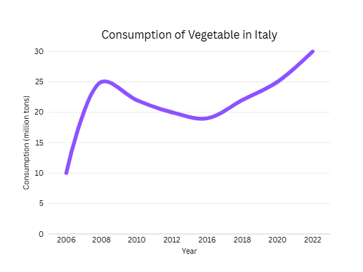
- Example: The vegetable consumption decreased by 5 million tons in 2016.
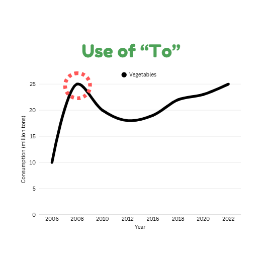
(ii) Use of the Preposition “To” in Line Graphs:
- Use: It shows the final point
- Example: The consumption of vegetables increased to 25 million tons in 2008.
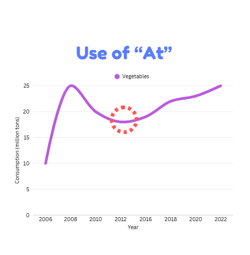
(ii) Use of the Preposition “At” in Line Graphs:
- Use: It shows the exact value
- Example: The vegetable consumption stood at 18 million tons at 2012.
Conclusion
To sum up, describing graphs effectively in IELTS Writing Task 1 requires not only a range of synonyms for increase and decrease but also accurate expressions for the degree of change, such as slight, gradual, or drastic. When combined with the correct use of prepositions, this vocabulary enables candidates to present data clearly, avoid repetition, and write in a style that meets academic standards. Building flexibility in language and precision in description is, therefore, a key step toward achieving a higher band score.