Line graphs
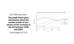
Quick Links: Band 5.5 Sample, Band 6.5 Sample Read the sample answer on the topic: The graph below gives information about the number of jobs

Quick Links: Band 5.5 Sample, Band 6.5 Sample Read the sample answer on the topic: The graph below gives information about the number of jobs

At the beginning of the period, beef was the most consumed meat, at approximately 210 grams per person per week, followed by lamb at around

The line graph presents data on the proportion of the population residing in urban areas across four Asian countries from 1970 to 2020, along with

The line graph illustrates the percentage change in the prices of three metals—copper, nickel, and zinc—on a monthly basis throughout the year 2014.

The line graph illustrates the participation figures for different activities at a social center in Melbourne, Australia, over the period from 2000 to 2020.